The Beauty of Simplicity
I can't stop thinking about this visualization I saw recently showing the population of U.S. states over the last 100 years.
Source: The Visual Capitalist
First of all, I was surprised to see my home state of Ohio, hanging strong at #7 for the last thirty years. But I was even more struck by the upward movement of states like Florida (#43 in 1917 to #3 today), Washington (#30 to #13), and Arizona (#46 to #14).
What's interesting is that when you read the text above and think about the change in ranking, it's not very compelling. But when you see the visualization and watch these states overcome so many others over 100 years of growth? Now that is astounding.
What's even better is that each individual data point represents so many people and experiences and stories I'd love to hear. To put it another way, the visualization is the beginning of a fantastic journey into understanding what has happened over time.
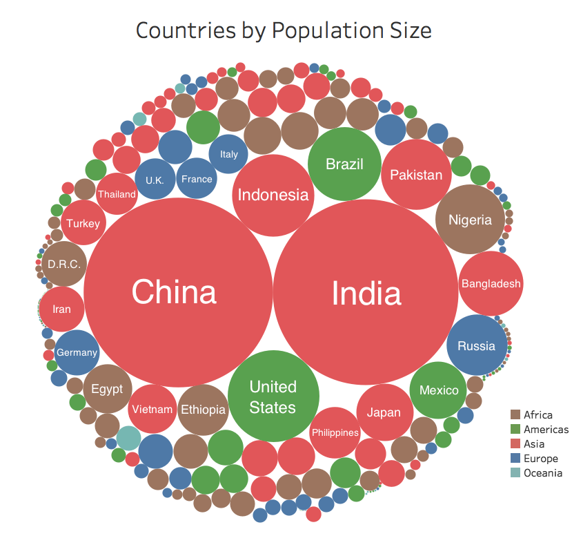
Population data often leads to fascinating data visualizations that help put things in proper context. I just finished reviewing charts of country ETFs when I came across this visualization of population by country.
Source: The Visual Capitalist
We all know that China and India have huge populations, but this one image puts it all into perspective. The people at Visual Capitalist put it perfectly, saying, "The beauty lies in the simplicity."
You can even access an interactive version of this visualization, which allows you to highlight specific countries or even entire regions. Click on "Americas", then click on "Europe", and then click on "Asia". Now you can see why the rise of Asia will likely be *the* theme for the next 100 years!
When thinking about the markets, I would take a straightforward visualization over tabular data any day. So there's a big difference between hearing: "Financials are weak this morning and banks are the only group trading lower," and seeing an image which drives home how every other group was up besides banks.
Source: Bloomberg
In the end, these visualizations are a starting point. The beginning of a process of discovery. A window into stories and themes that can help you become a better, more informed investor.
RR#6,
Dave
Disclaimer: This blog is for educational purposes only, and should not be construed as financial advice. Please see the Disclaimer page for full details.


