
One Chart: Small Caps
I love to ask interviewees if they had one chart to get a good read on the overall market environment, what would it be and why? My One Chart for today is IWM, the small cap ETF.
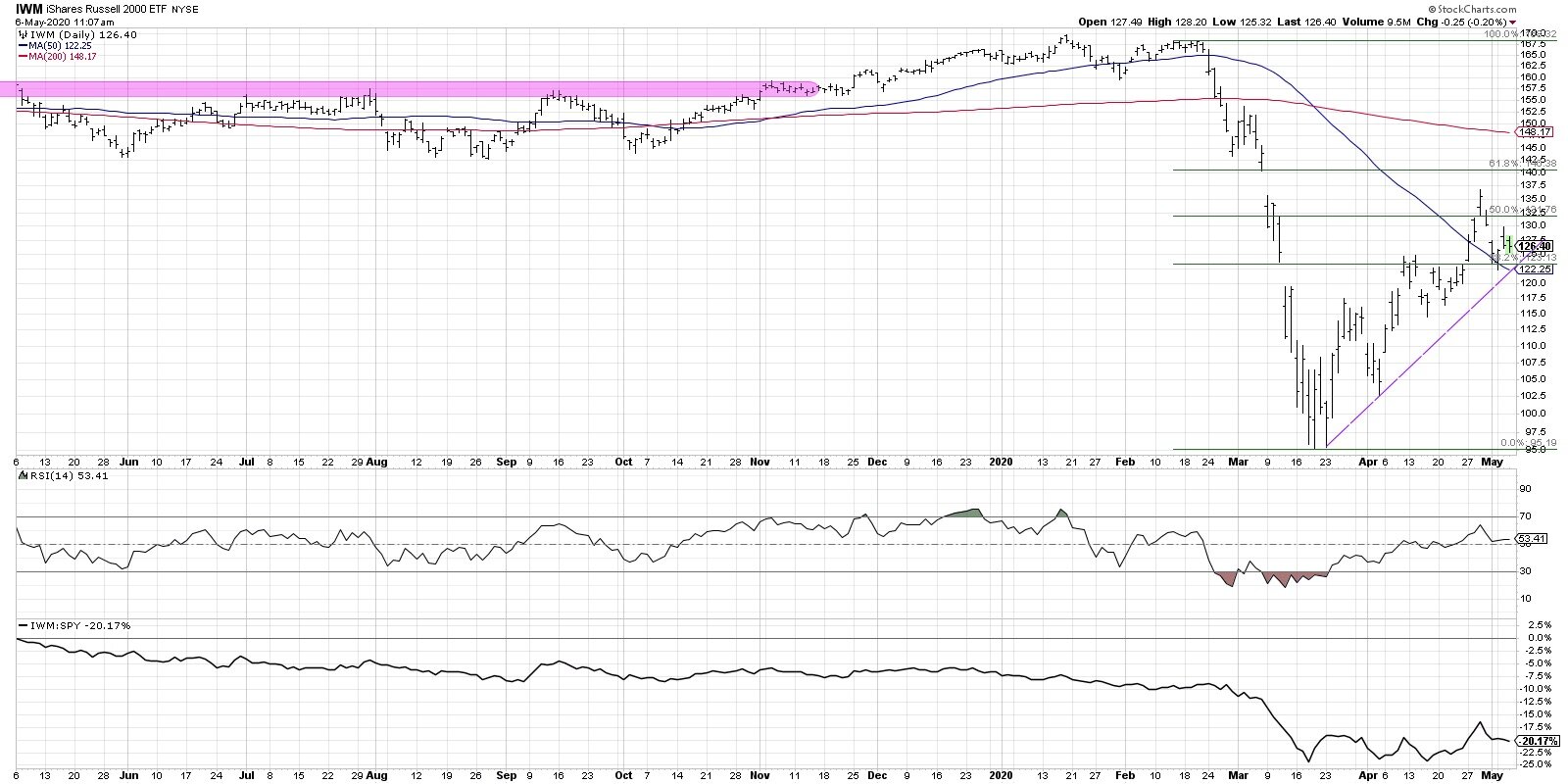
At the bottom of the chart you’ll see the relative performance of the IWM vs the S&P 500, and this long-term underperformance of small caps vs large caps is hopefully not a surprise to anyone. This phenomenon of large and mega cap stocks dwarfing the performance of small caps has been an ongoing, chronic issue. And it’s not just new to the downturn. This underperformance really accelerated mid-February to mid-March. As the market fell off a cliff, small caps certainly led the way down.
You can read more over at seeitmarket.com.
RR#6,
Dave
Disclaimer: This blog is for educational purposes only and should not be construed as financial advice. Please see the Disclaimer page for full details.